Staging a home is a delicate balance between creativity and logic

When home staging goes awry, it can be damaging from the start. Although over 30% of the properties we shoot are vacant, if you decide to stage your home, here are some common mistakes to avoid:
You chose loud, chaotic colors
It’s easy to get carried away with colors, but play it safe with this one. Your bold color palette will deter a number of homebuyers searching for calm, neutral tones.
Select a neutral palette with pops of color. Strategically placed complimentary colors throughout will capture a buyer’s attention. These colors can be highlighted on decorative pillows, throws and wall decor.
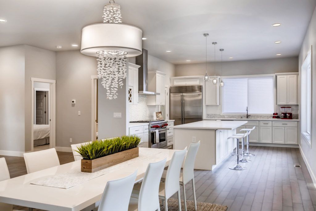
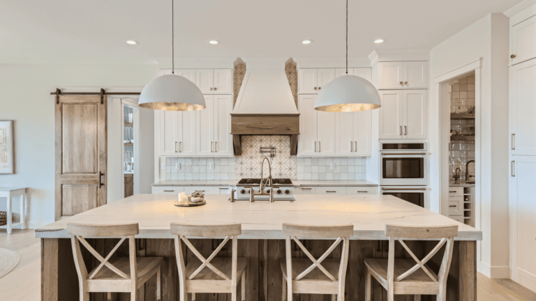
You don’t need to use a stark white on the walls to create vastness. A beige, gray or “greige” color will still make the space feel open while adding warmth and will help the buyer’s eyes flow from one room to another.
Virtuance expert tip: Try not to use drastically different paint colors for each room. This will compartmentalize the home and make everything feel smaller.

You slacked on lighting – natural and artificial
Proper lighting is one staging feature that sellers and agents tend to neglect. Lighting is a key element in showing off your listing both online and in-person. To show a space well in photos, make sure that blinds and curtains are easy to open so your photographer can bring in the most daylight possible. This will make the space bright and welcoming.
It is also important to have working bulbs in all of the light fixtures. Buyers want to get a sense of the space as if it is already lived in. They also want to be able to see all corners of the house.
Virtuance expert tip: Bring in more light by placing mirrors on a few of the walls. This helps light bounce around the room and also adds a nice decorative touch to a bare space.
You are not staging to scale
Staged furniture needs to match the size of the room. You may feel that you are creating a spacious room by using smaller furniture or pushing your furniture against the walls, but the effect is actually the complete opposite. Not staging your furniture to scale can dwarf a room and turn buyers away.
In properties with open concepts, staging should be set up to show the functionalities of the space. Homebuyers need to grasp an understanding of how they will utilize open spaces. A poorly laid out room or one that lacks staging altogether will leave buyers wondering “how do I work with this flow?”.
Virtuance expert tip: Warm up a living space by adding a rug underneath larger pieces of furniture, otherwise, couches, beds, and coffee tables will look like they are floating and not coherent.

You opted for fake everything
Fake fruit, fake plants, and fake television screens…not a good look! We understand the allure of filling a space with flowers that won’t wilt and fruit that won’t rot, but buyers don’t.
Spend some extra time, and money, placing fresh flowers in the bathrooms and kitchen at the very least. Flowers and plants look incredible in listing photos and allude to freshness, wellbeing, and happiness.
Virtuance expert tip: Skip the grocery store bouquets and opt for flowers that have a longer shelf life. Try potted plants like peace lilies, or heart-shaped philodendrons. Add spa-like elements to the bathrooms with white orchids, which have a blooming season of 3-4 months!

You designed based on personal taste
Real estate agents that have years of experience under their belt may develop an eye for design but err on the side of caution here. Spend some time online browsing other listings in your area to see the latest staging designs. Focus on ‘hot homes’ that gain interest faster than other comps.
More of a left brain agent? Bring in a designer for some expert advice, or hire a staging company. Do not count on your personal taste winning over a majority of buyers. Again, stick to warm neutrals and contemporary pieces. Keep it simple.
Virtuance expert tip: Neutrals does not mean sterile. If your space ends up feeling stuffy or cold, learn how to warm it up here.

You attempted themes that don’t blend well with the space
Home staging expert, Debra Gould, said it best, “Great home staging is invisible.” There are many driving factors for homebuyers to want a specific house, but ultimately, they need to be able to picture themselves living in the space.
Avoid strong themes in your staging. A well-staged home is one that doesn’t feel staged at all. The key to staging is showing the home as cozy, inviting and relatable. A fully set dining table or a ‘baking scene’ in the kitchen is distracting and even laughable to some buyers.
Virtuance expert tip: Think of home staging in strategic phases. For professional listing photos, the less clutter the better. For showings, add a few everyday items to make buyers feel at home.
You ignored the exterior
The exterior is one of the most impactful features of a home. It is usually the first listing photo, and the photo that buyers spend the most time viewing. Furthermore, the exterior is the buyer’s first impression of the home.
Most sellers are not going to want to repaint or update their landscaping, but there are small adjustments that can make a big impact. The exterior can be quickly spruced up with potted plants, a leafy wreath, a new doormat and outdoor IKEA furniture.
Virtuance expert tip: Give your exterior some love by cleaning out the gutters and pressure washing the siding/brick. A rundown exterior will make buyers think you haven’t kept up with the interior.

Overall, successfully staging a home can be simple with strategy and planning
Remember the basics – remove the clutter, stick to neutrals with pops of color, and create flow with lighting, paint and scale. Effective staging will drive online listing traffic, sell listings faster and help you continue to build your brand.


